The new logo
The bell rings.
Colour moves.
Experience begins.
EEE 2026 – A Call to Experience
Cyan opens the horizon.
It recalls the sea, the breath of space and possibility, and the depth where learning begins.
Layers of colour echo the land—sea, earth, light—stratified like experience itself.
Learning unfolds horizontally, through connection and shared presence.
Soft curves move like waves. There are no sharp edges, only flow, rhythm, and transformation.
The bell rings on the left.
A beginning. A call to gather, to listen, to step into experience.
This is EEE 2026: rooted in place, open to the world, alive with movement.
Manifesto
We believe learning begins with experience.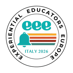
With the body, with presence, with connection.
EEE 2026 is a call to gather, to listen deeply, to move together, to learn from place, people, and process.
Like the sea that surrounds us, learning is fluid.
It unfolds in layers, shaped by reflection and relationship. It is horizontal, shared, alive.
We meet in Italy, where land, history, and community overlap.
Here, tradition and movement coexist.
Here, learning is rooted—and open.
The bell rings to mark the beginning.
Not an end, but a threshold. An invitation to step into experience.
This is Experiential Educators Europe 2026.
A space to explore.
A time to connect.
A movement in learning.
Logo Explanation
1. Cyan as a guiding color: sea, horizon, opening
The cyan is the color that runs through and holds together the logo, becoming its emotional and environmental axis.
It is a color that immediately recalls:
- The sea, a key element of the Italian landscape and in particular of the Tuscan coast
- The horizon, a symbolic place of possibility, learning and boundary-breaking
- Depth and transparency, essential qualities in experiential educational processes
In the context of EEE 2026, cyan works as bridge between nature and knowledge: it is not a static or institutional blue, but a vivid blue, crossed by light, which suggests movement, breath and relationship.
It is the color of water that welcomes, reflects and transforms, exactly like the educational experience.
2. The Horizontal Lines: The Synthesis of the Italian Landscape
The four colored lines that start from the bell and cross the logo can be read as abstraction of the Tuscan landscape and of Italian nature:
- Yellow (Sun and Energy): The top line represents the Italian sun, the warmth of summer, and light, a fundamental element for an “experiential” event.
- Orange (Creativity and Sociality): It recalls the architecture of Italian villages (the terracotta roofs), but also the sunset and the human warmth of Mediterranean hospitality.
- Terra di Siena/Brick Red (History and Roots): The third line is the quintessential Tuscan color. It symbolizes history (“Since 1997”), local roots, and concreteness.
- Green (Nature and Sustainability): The baseline that supports the others. It represents the hills, the maritime pine forests, and the commitment to outdoor education and nature.
The overall effect:These lines aren’t just decorative; they tell the story of the layered experience participants will live: sun, culture, history, and nature.
Horizontality as a community
The horizontality of the lines refers to one of the fundamental values of EEE: non-hierarchical, shared, dialogic learning.
There is no line that dominates the others, buta coexistence of plans, as happens in experiential learning groups.
Italy as a stratified place
Italy is a land ofhistorical, cultural and landscape layers. The lines can thus evoke:
- time (past, present, future)
- cultural sedimentation
- the multiplicity of languages and identities that coexist in the same space
3. Rounded shapes: movement, flow, corporeality
The rounded shapes of the bell and the letters “e” are one of the most dynamic elements of the logo.
Softness and accessibility
The absence of sharp edges:
- makes the logo welcoming
- lowers the access threshold
- communicates care, listening, humanity
It is a trait consistent with experiential education, which starts from the body, from emotions, from relationships.
Movement and continuity
The curves suggest:
- flow
- cycle
- process
Not a static event, but an experience that moves, evolves, changes direction.
The “e”s almost seem to dance or vibrate, referring to the idea oflearning by doing, on the move.
4. The bell on the left: ringing, start, call
The choice to place thebell on the left sideis highly significant.
Temporal reading
Il “Via” (Call to Action): In Western culture we read from left to right. Finding the bell at the beginning of the visual sentence transforms into point of origin. It’s the triggering event. The bell rings and the energy (the colored lines) spreads from it, leading to the formation (eee).
In many Western visual cultures, reading proceeds from left to right.
The bell on the left then becomes:
- the first sign
- the origin
- the zero moment
Like a chime that opens the time of the event.
The bell as a collective call
Community Symbol: In Italy,the bell is the heart of the village and the communityIt not only marks the school day, but also calls people to gather in the main square. Position it as “”visual drop cap” emphasizes that the event is a moment ofgathering.
The bell is a powerful symbol:
- call the community
- marks a passage
- invites to be present
In the EEE context, the bell states: “It’s time to stop, listen, meet, and experience together.”
Italian tradition
The bell also calls:
- the villages
- the squares
- the monasteries
- Italian community rhythms
A sign that roots EEE 2026 in the territory, without making it folkloristic: a tradition reinterpreted in a contemporary key.
5. A logo that sounds, flows and connects
Sound Propagation:Graphically, the horizontal lines appear to physically emerge from the bell. It’s a synesthetic visualization of sound: the message of Experiential Educators Europe spreading, vibrating through the colors of Italy.
As a whole, the EEE 2026 logo:
- it plays (Campaign)
- it flows (lines and cyan color)
- it moves (curves, rounded letters)
- it connects (horizons, communities, levels)
It is a logo that does not only describe an event, butalready implements an experience: invites movement, listening, and relationships.